My Take on Health Bars
Health indicators are found in almost every game. As Chris pointed out, they come in a variety of shapes and sizes. When it became time to think about them in my game, I wanted to add something that was functional, but also unique or interesting in some way.
Here are the conditions that my health bars had to meet:
- Too cluttered to exist on an individual unit, so they had to represent the entire group.
- At a glance, clear what total health would be, and when health has been removed.
- Ability to be different colors.
- Not too demanding technically.
- Compliment, and not distract, from the units icon.
- Also, must work with icons of different shapes.
- And, must work for units of different sizes.
- Work together visually with a units selected state.
Here’s what I came up with:
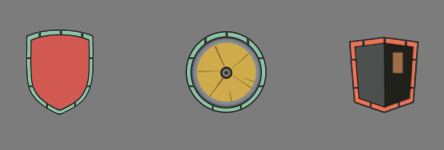
Surprisingly, this was a 2 day process, which shows how hard it can be to estimate for the “little things.” Let’s talk about a few of the considerations.
Health Removed

How does the image above look when health is removed? There is definitely enough contrast for missing health, and it is easy to check if something is ~50% health, or some other large mark. However, one criticism I have is that it is tough to tell, at a glance, the starting health of a squad. That’s an acceptable compromise for me, as the player will also see the actual units on screen, and be able to visually tell, for example, if there are 4 or 9.
Selecting a Unit
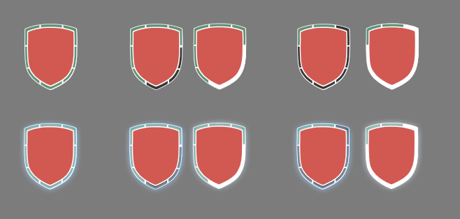
Next, how would this implementation handle units that have been selected by the player? At first, I tried toggling the actual color of the health bars. In the image above, notice the shields with black bars indicating that they are missing. That idea just added too much confusion, so I went with a white background, and missing bars, for a selected state.
The second thing I tried is a blur. The main problem with the blur is that it lowers the contrast of the health bars. So, while it achieves the effect of making something look selected, it comes at a cost. I will keep iterating to find a balance that satisfies both requirements.
The main knock at this step is that a separate sprite is required for the selected state, and I was hoping to achieve it with color changing only.
Enemy Units

Once I was happy with friendly units, I made sure this would work for enemy units. The pleasant surprise here is that it works, and it actually aids the user in quickly recognizing good versus bad. Also add bonus points for it being fairly easy to implement.
    if self.squad.friendly {
        self.pictureToMask.color = UIColor(red:0.533, green:0.769, blue:0.639, alpha:1) /*#88c4a3*/
    }
    else {
        self.pictureToMask.color = UIColor(red:0.929, green:0.455, blue:0.318, alpha:1) /*#ed7451*/
    }
I can expand this further into NPC’s, damage over time indicators, and so on. Just set up a pList file of color options, and we’re good to go.
Notifications

This part was tricky because I don’t know what notifications, if any, my game will have. In fact, this is a challenge with game development overall — trying to plan for everything because it is impossible to know what will and won’t work. Anyway, I ran a quick test to see how cluttered this would look with other information in the area. I’m not fully satisfied, but confident I can find a working solution. Moving on!
Implementation
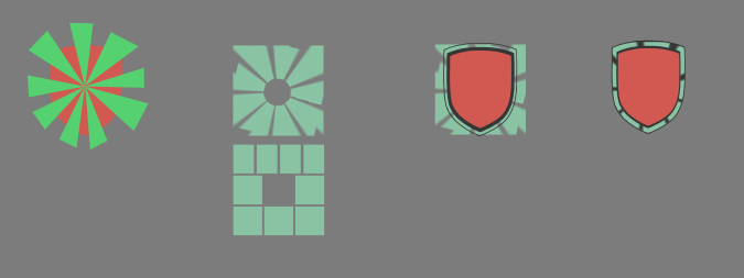
Implementation is a bit tricky, and a bit resource intensive. Here’s what is happening:
- Shield is an image, with an outer border 10px away. Transparency in between.
- Dark background in shape of first image is added underneath.
- Grid, or sunburst added in between the two above. Same dark background set as the mask for the grid.
So, 3 images to achieve this. The middle layer could be done dynamically, but SKShapeNode is horrible in SpriteKit. I may have to spend some time trying this with CGPath’s, as that would save the majority of the resource usage.
One other note — regardless of if you use sunburst or squares, there will be discrepancies in each health bar size. You can see the sunburst example above on the right. Some gaps are larger than others. For a grid implementation that isn’t divisible by 4, the bars will be different lengths (see above for that as well).
While I still have a few things to tighten up, I love the end result.
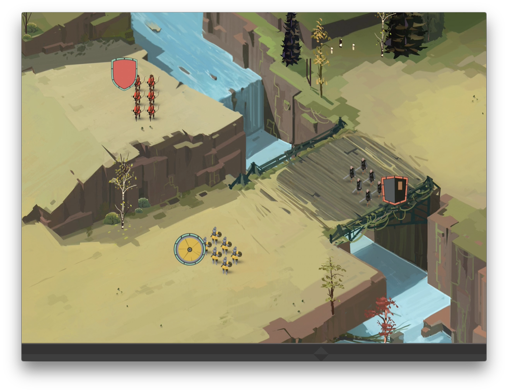





These look awesome. With each post I get more and more excited to play the game. I am working on skill progression bars at the moment so it is nice to see this approach.
Thanks! Just checked out your dev blog as well. Good stuff. It's fun to see someone else go through a similar process.
Thanks I have been reworking a lot of my old code over the last few weeks which as you must know means that their is no visual update. :) How did you decide what screen size to develop for? or are you only developing for tablet?
Good old refactors :) Trying to do phone, tablet and OS X. In my testing 2800x1880 is the best to fit all 3 of those. Part swill get cut off, so there is a region that will contain all of the important details to make sure it shows up on every device. Kind of like this: http://battleofbrothers.com/sirchris/designing-backgrounds-for-multiple-aspect-ratios-and-coronas-config-lua