Health Display Roundup
Visually displaying a character’s health has been around for over 30 years and continues to be a mainstay of video games. From Zelda to Starcraft, these small graphics play a large role in how games are played and how information is communicated. The turn based game I’m working on will include health bars, so I’ve been looking into how other successful games have given their characters life. Here is a quick roundup of some of the more popular techniques I’ve come across.
Bar Above the Head
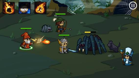
The good ol’ bar above the head technique is probably one of the most common ways to display health. You can see this in Battleheart and Starcraft 2 and one thing I like about their implementation is that they both change the color of the bar in order to add a secondary visual cue. This is particularly helpful when you have to make extremely quick decisions, like whether or not to run from a Zerg swarm.

Circular
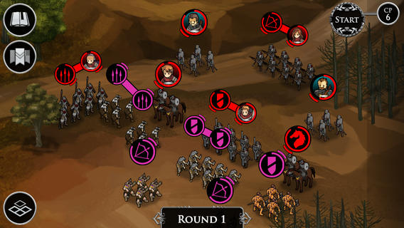
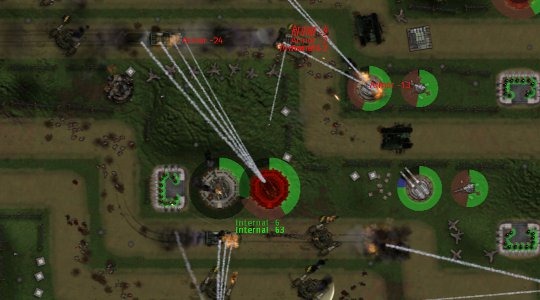
You don’t see circular health displays all that much, and I think part of the reason is due to screen real estate, but two games that pull it off are Ravenmark and Gratuitous Tank Battles.
Half Circle
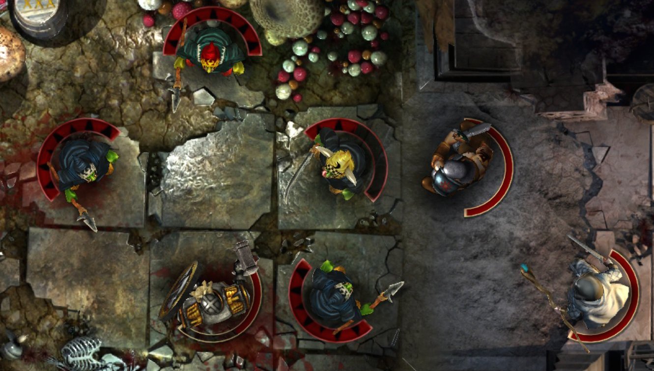
What happens when you introduce the standard health bar to the circular health bar, turn on a little Barry White, and wait 9 months? The half circle health bar is what happens. I’m not sure pioneered this concept, but Rodeo Games has two great examples in Warhammer Quest and Hunters 2.
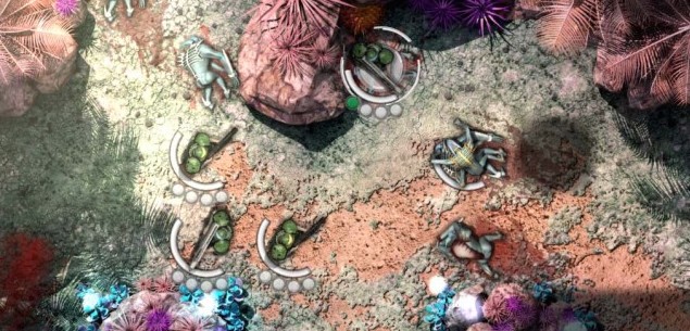
Unique and Stylish
Who says health displays have to be simplistic colored bars or circles? I think The Banner Saga and Skulls of the Shogun did amazing jobs by making the health displays a part of their game’s overall artistic style.
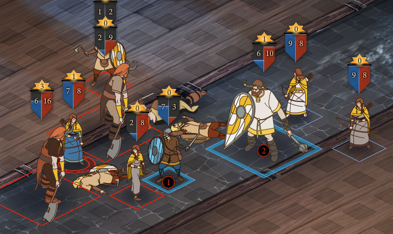
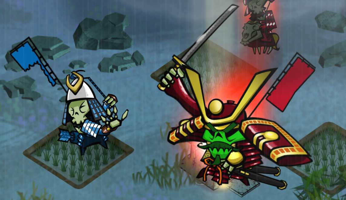
Unit Count
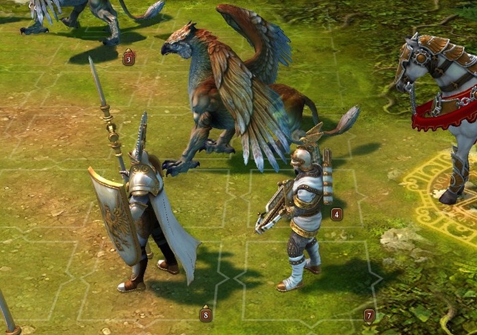
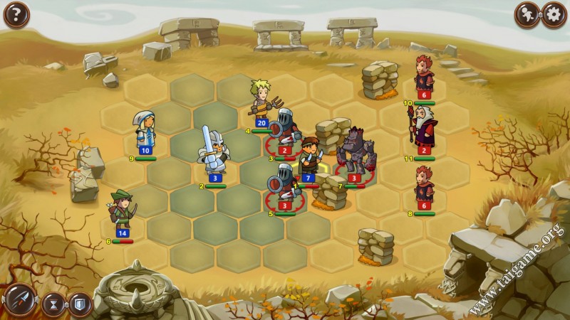
It would be awesome if we could create massive armies like you see in Rome Total War, but that isn’t possible for a lot of reasons. A quick and easy way to show that there are multiple units, without actually displaying multiple units, is by adding a number signifying how many units of a single character exist. Below you can see what I’m talking about in Might and Magic 6 and Braveland.




[…] easy way to add distinction and flavor to your game is to make seemingly standard concepts into unique game art. For example, two visual elements that pretty much all turn based tactical games contain are a […]
[…] common to see health bars attached to a characters in video games, and in this tutorial I explain how that can easily be accomplished in Corona SDK. […]
[…] indicators are found in almost every game. As Chris pointed out, they come in a variety of shapes and sizes. When it became time to think about them in my game, I wanted to add something that was functional, […]