

Designing Backgrounds for Multiple Aspect Ratios and Corona’s Config.lua


One of the reasons I chose Corona SDK as my development platform was because they support many devices across many platforms. But mo’ devices means mo’ problems, and one of those problems is creating artwork that scales across all devices.
Artwork isn’t cheap, especially when you’re working with contractors, so you’d like to reuse a single piece of art on all of the devices you’re targeting. One problem with supporting multiple devices is that different devices have different aspect ratios, so an image that fills the screen in one device may look bad in another device. For example, here is how an image that’s specifically created for an iPad 3 looks on an iPhone 5.
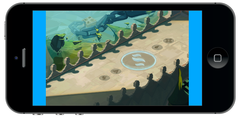
You can see that the iPad adds spacing to the left and right of the image. This is because the iPhone has an aspect ratio of 16:9, while the iPad has an aspect ratio of 4:3. This gives the iPad more screen real estate vertically, but it gives the iPhone more space horizontally. If you were to create an image specifically for an iPhone, then the top and bottom of the iPad would end up with added spacing.
Corona has a clever way of dealing with resolution related issues with their config.lua file and dynamic content scaling, which take resolution out of the equation and allow you to use a common set of screen coordinates and graphics across all devices. This is great because if you were to position a graphic at screen position (0,0), it will always appear at the top-left corner of the screen. It’s also great because images are also automatically scaled to almost look the same in devices.
I say almost look the same, because we still run into problems when screens have different aspect ratios. Corona will make an image on an iPad and an iPad Retina look exactly the same, because even though they have different resolutions, they have the same aspect ratios. But even with image scaling, there is no way to fit the exact same image into an iPad and an iPhone without distorting the image. The solution to this problem is to create a background image that caters to all aspect ratios . It needs to be as tall as the tallest resolution and as wide as the widest resolution. The magic number currently appears to be 2850 x 1800. An image that size allows us to do a few things:
- Support 4:3 and 16:9 aspect ratios
- Support high res devices like the iPad 3
- Create 1x and 2x size images, with 1x at 1450 x 900 and 2x at 2850 x 1800. The 1x sizes are used for devices with a smaller screen width to preserve memory.
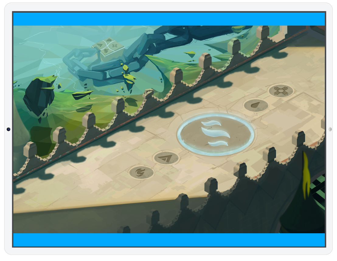
An image created at the “magic” resolution will need a little bit of cropping because it doesn’t exactly fit either aspect ratio. The solution to that is to add some good looking yet non-critical additions to the area that could potentially be cropped out. If you take my previous example and add a little extra fluff content around the top and bottom of the image, here’s a picture of what would be seen in the iPad and iPhone.
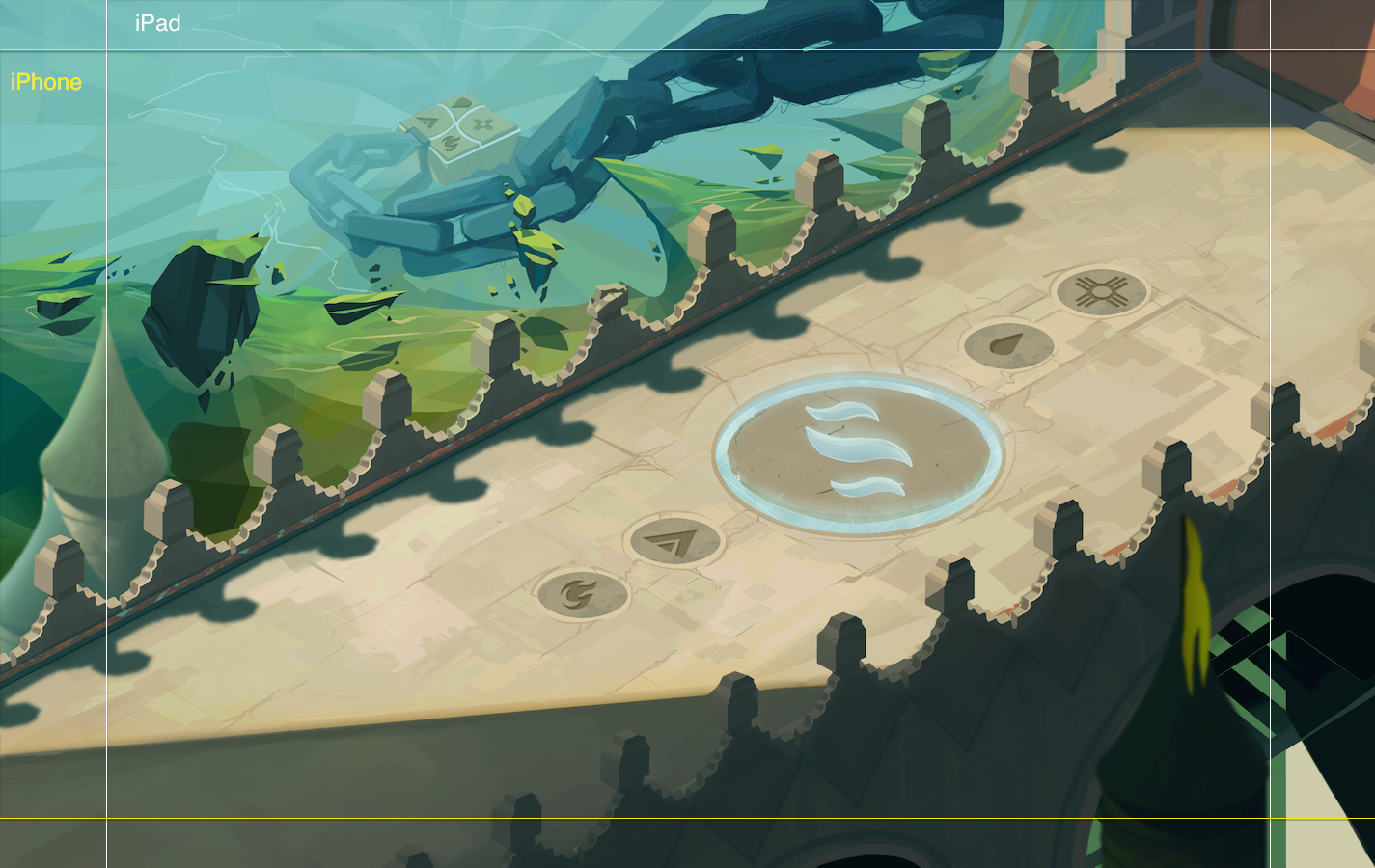
The iPad still has more vertical room and the iPhone still has more horizontal room, but I’m able to use a single illustration for both screens by only adding non essential artwork to the areas that are cropped. That same image would work across a variety of mobile devices and even desktops.

Great read, I'm also working on the Corona platform. The art looks amazing, I know you mentioned you're spending a huge bulk of your budget on artwork and it looks like it's paying off. Love the brotherly challenge going on here. Do you utilize the cropped space in either device at all or is it purely meant to be used as filler?
Thanks, Harry! The cropped space is just a filler used for aesthetic purposes.
You should release some video of your game, I would love to see the gameplay evolving.
Me too, but It takes awhile to animate the characters. I could put my old cheesy characters on the new battlefields, but I'm trying to wait for some of the new character animations.
kk cool. Super psyched about this, I played the shit out of tactics-style games in high school.
So if I create a background in photoshop, I would use these settings? Width: 2850 Pixels Height: 1800 Pixels Resolution: 72 Pixels/Inch
Yes, that would work, but you might even want to go bigger with Corona now supporting desktop games. I'm currently using 4275 x 2700 as my base resolution.
<a href="http://miledy.biz" rel="nofollow">miledy.biz</a>