

Evolution of a Level


It’s amazing how long it can take to make your first level. It seems so simple at first. Just put a castle here, some grass there, and call it a day. But, questions arise. What art style should we go with? Will sprites be light or dark, so that we know what color grass and flooring to use? How wide do walkways need to be? Basically, figuring out your first level is like figuring out your entire game. Because of that, my first level continues to change. I thought it would be neat to take a look at where it started, and where it is now.
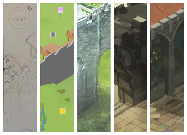
Paper
I began with a paper drawing of a tower defense game. You can see the castle wall, and the mountain range up top. Also, tons of notes of how I thought the game could work.
Prototype
I use Kenney’s assets for my prototypes. At this point, the concept still seemed to work, so it made sense to try to find an illustrator to work with.
Trial Art
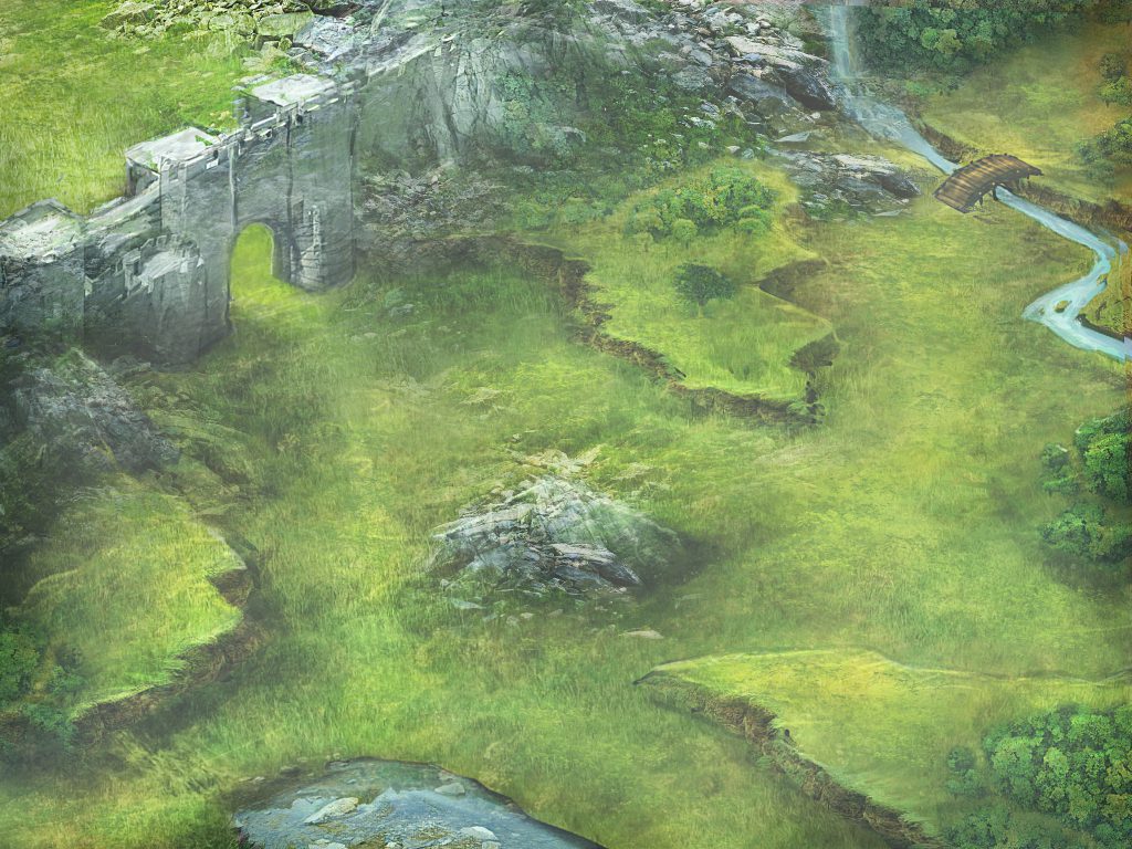
This is the first piece of trial art I received. I love the illustrators work, and he is also a flexible / friendly guy. While I thought this style of art could work, I realized that the characters had to be way too detailed to look like they fit into this world. That detail drove up the animation cost, so I went a different direction in the end.
First Attempt
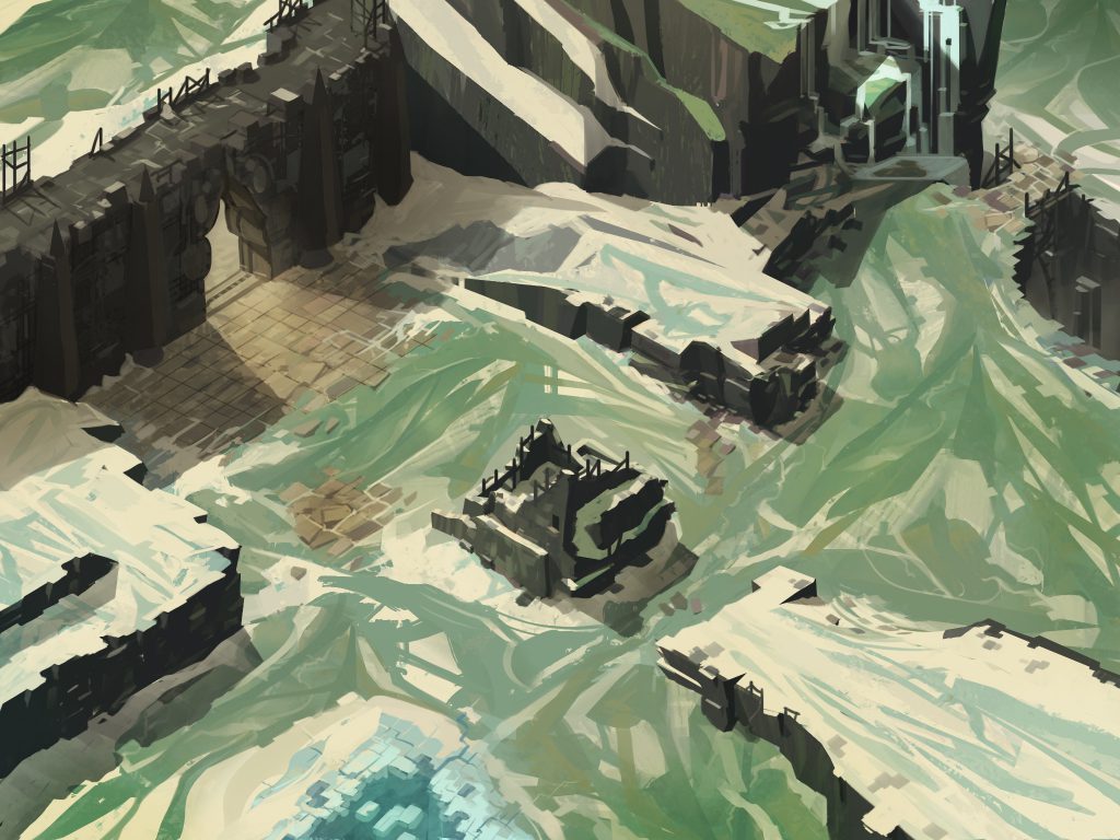
This is the first pass I received from Scott, my current and long term illustrator. I loved the angular look, and the details found on the bridge, castle wall, and crumbled tower. Main problems at this point were that the floor was too noisy, and the castle wall too dark for medium-dark toned units to sit on it.
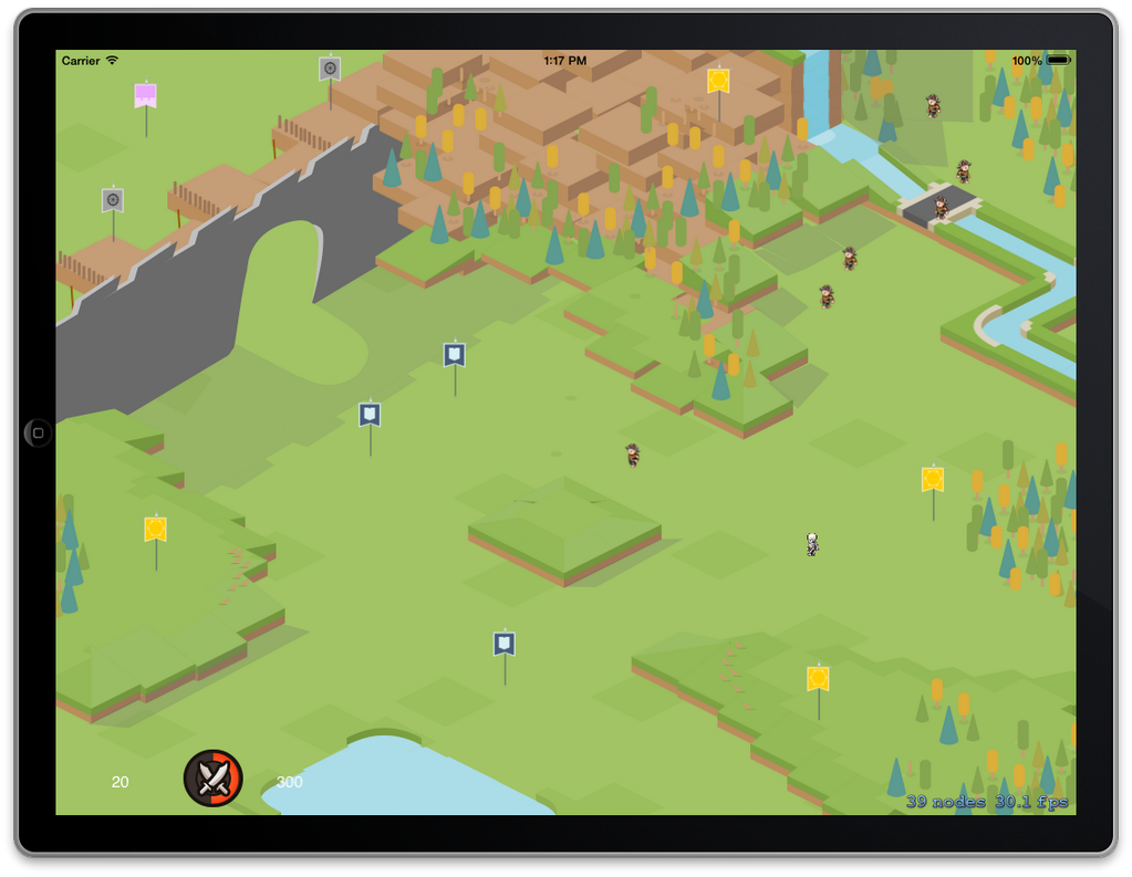
Refine
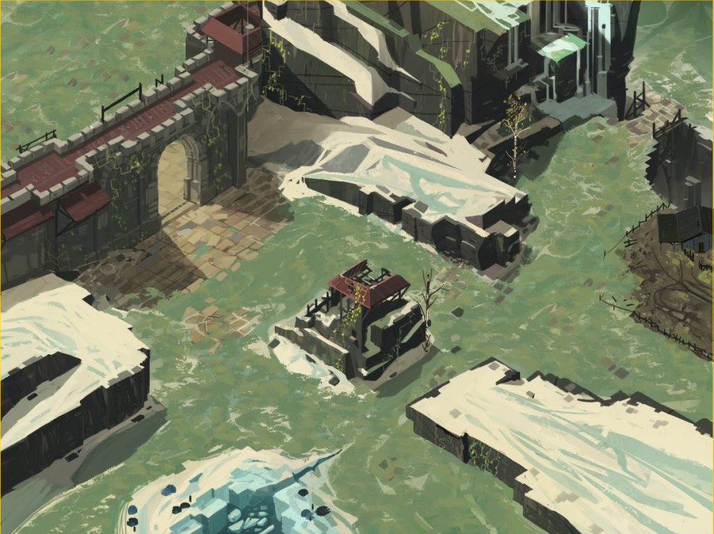
This next iteration brings more detail to the floor as well as lightening it up. The castle wall is lighter, and has a marble flooring in front of it. Other little details like a roof on the rubble, trees, and polish on the ice lake appear.
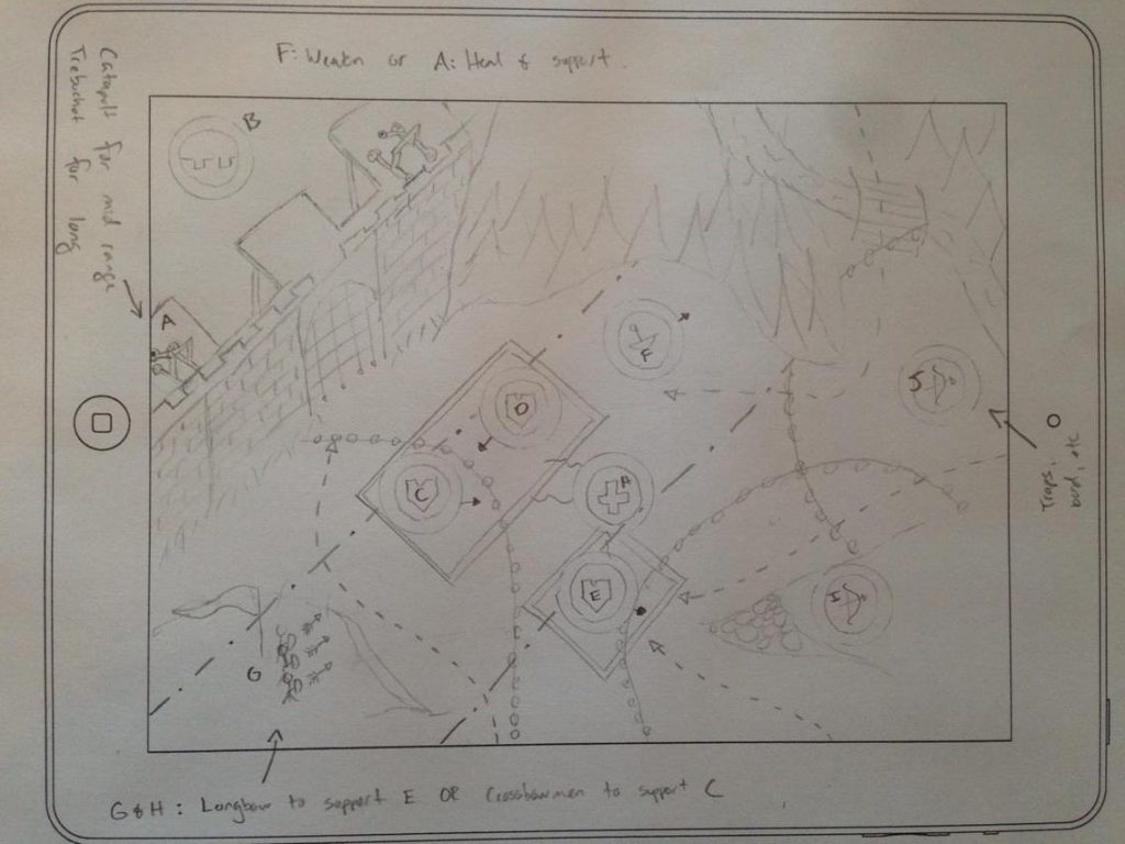
Pivot
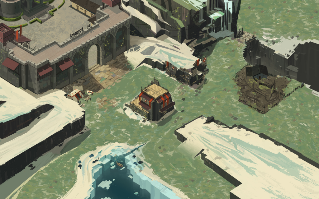
When I realized my game wouldn’t become the straightforward tower defense game that I had in mind, the map had to slightly change as well. The map will now pan on an iPad and iPhone, so the art has been extended to a wider aspect ratio. Ramps have been added to make certain areas accessible. Also, notice that more spacing has been added between the ruined tower in the center and the rocky cliffs south-east of it. Lastly, certain props like the farm can be added and removed depending on gameplay needs. In general, I’ll need wider walk areas since I’m working with units in formation now.
What’s Left?
Hopefully, there are no major changes left to do. But, there are plenty of minor changes and polish to consider. Examples:
- Make the ramps look more natural.
- Blend the marble flooring near the castle wall better with the environment, so that this works on every map.
- Add / remove trees depending on how much space I need for units to walk.
- Figure out UI and game functionality for turning the rubble into a functional tower, and what sort of art is needed to convey that.
- Potentially make some areas, like the bridge, wider to accommodate final unit types.
Answering as many questions as possible on this first map definitely helps with the second. I’m hoping, and crossing my fingers, that the next map will be much faster now that the core gameplay is getting closer to a final version.

Thank you
Your comment will be published once it has been approved.
to see the pull request you generated.