More Difficult Than Expected
 This post is a status update, which is how I track progress specific to my game.
Check out my timeline to see what I've recently accomplished.
The past two weeks have been a real shot to my confidence. It turns out that a perfect game does not live inside of my head. Instead, a game with real usability, budget, and gameplay issues lives in my head. Researching some of the questions I needed answers for last week revealed that there isn’t always a perfect solution, and that my game idea needs refinement.
As always, you can watch the video version of this post, or read the content below it.
This all started when I showed Chris my demo and he asked a valid question.
How will users tell what level their tower is at a glance?
I pointed out that the flags appearance change as you level up, so the user should be able to keep tabs on it. Fair point, right? Except, when you leave the flags on the map as the level progresses, things start to look really chaotic.
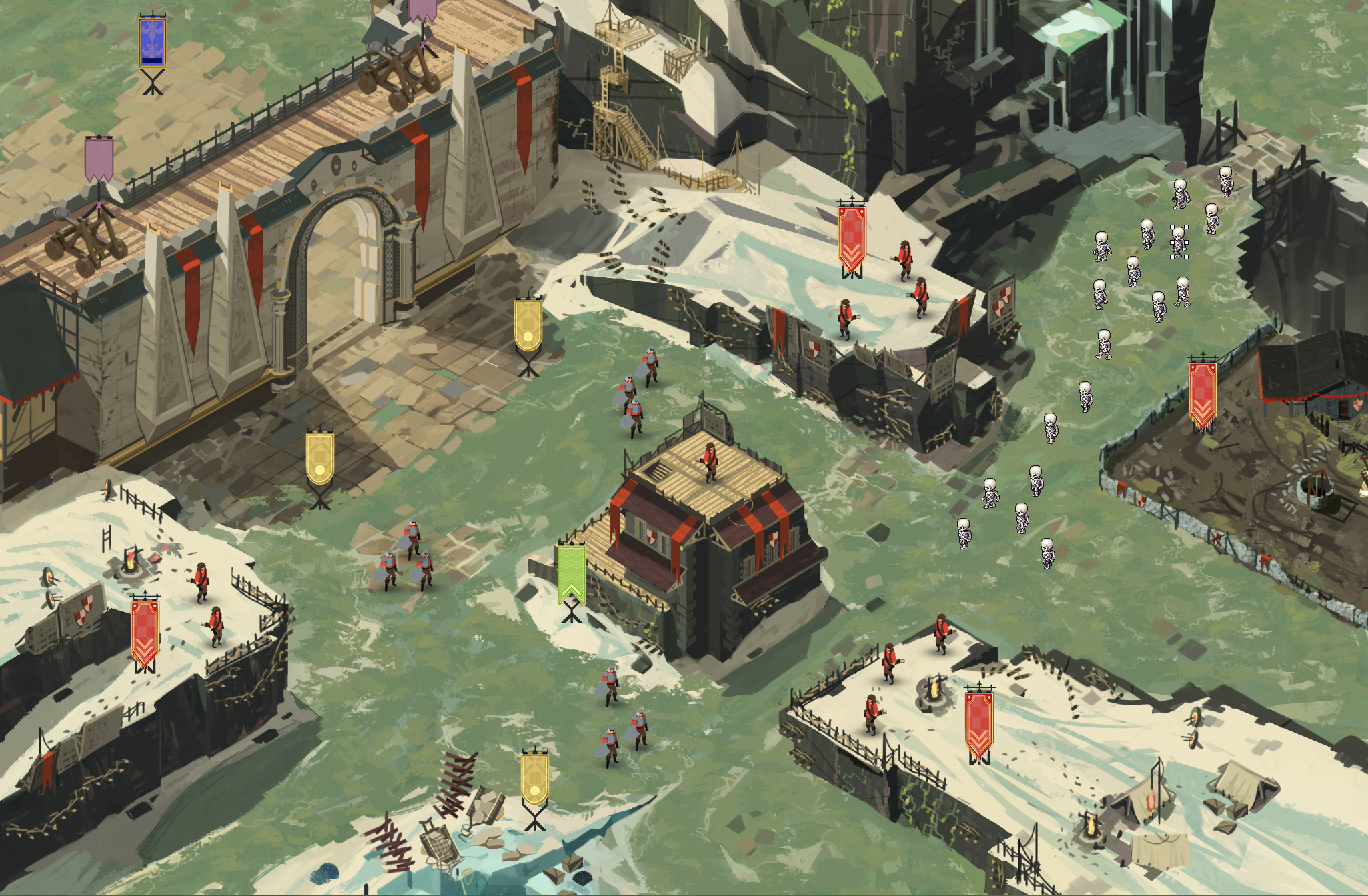
As you can see, everything is competing for attention. Have a look at how much cleaner it becomes when we remove the flags and environmental noise after a unit has been purchased.
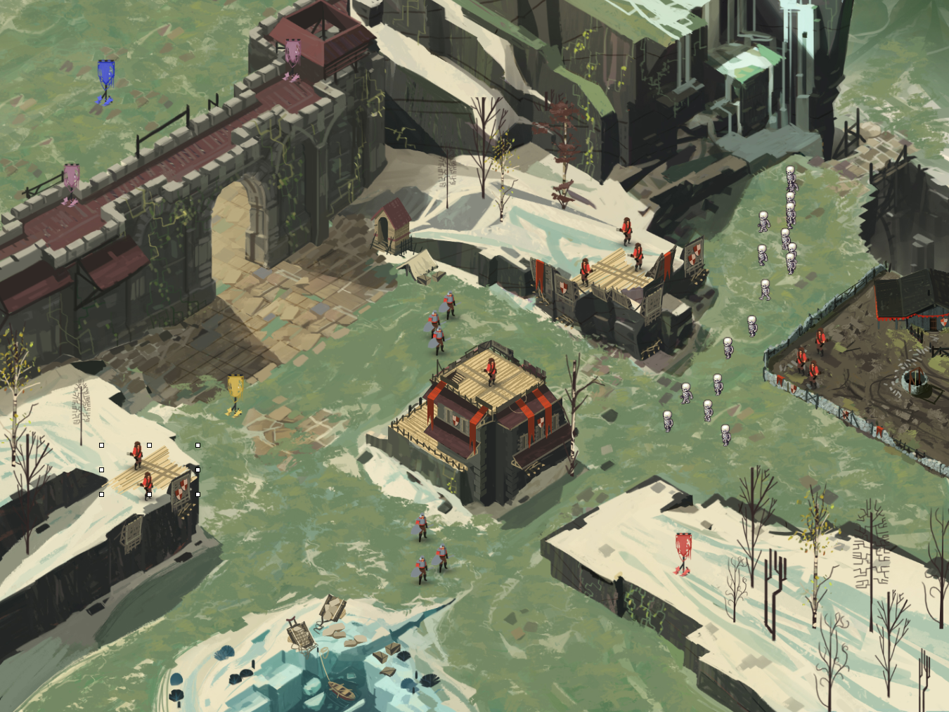
Much easier to parse what’s going on. Problem is, the flags and environmental changes are supposed to be the identifiers. Without them, there is no level progression. Argh! With that in mind, I thought it would be a good idea to try to use materials to show level. Wood for level 1, stone for level 2, and marble for level 3. You can see that concept here:

And while that somewhat solves the problem, it would take up 35% of my illustrators time on every map. That’s just not an acceptable solution. So, in summary, the complete list of problems with my approach were:
- Archers and mages weren’t able to spawn at the same spots, which limited gameplay.
- Memory usage was way too high since the environment changes stuck around as you progressed.
- Everything was competing for attention via color.
- No visual /at a glance indicator to recognize somethings level.
- No cool factor — towers and units didn’t give off that awesome feeling of being upgraded.
Really, the solution to a lot of my problems is to follow the path already paved by the other tower defense games out there. Static towers, fixed with paths, etc. That just doesn’t excite me.
It’s Pivot Time!
Because of my desire to bring something new and immersive, I just can’t move forward with the tower defense genre. Instead, I’m going to slightly change to a castle defense sort of game. Same scope, perspective and art. Instead of upgrading towers, you’ll be managing units. There will be the occasional tower on the map that you try to defend / hold to get its benefits, but that’s it. Trust me, it’s really cool in my head.




Thank you
Your comment will be published once it has been approved.
to see the pull request you generated.