Now We’re Rolling
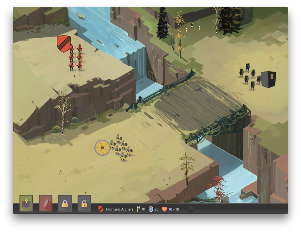
 This post is a status update, which is how I track progress specific to my game.
Check out my timeline to see what I've recently accomplished.
Things are moving along much better now. I wouldn’t say moving quickly just yet, but they’re at least moving. I’ve overcome a lot of technical hurdles and learning curves in the past 3 months. The latest of those was how to support 100-150 units on the screen at once. Serious progress has been made in that department. And, as always, I’ve received amazing illustrations and animations from Scott and Liron. Lastly, I’ve dabbled a bit in icon making.
Let’s jump to the video for more.
Supporting an Army
How many units can I fit on the screen at once? I hate to optimize code this early in the process, but the answer to that determines a lot about how my game will flow. After a week of focusing on this, optimizing the compiler, testing different approaches, and going through the code piece by piece, I can support ~90 units at 50% CPU.
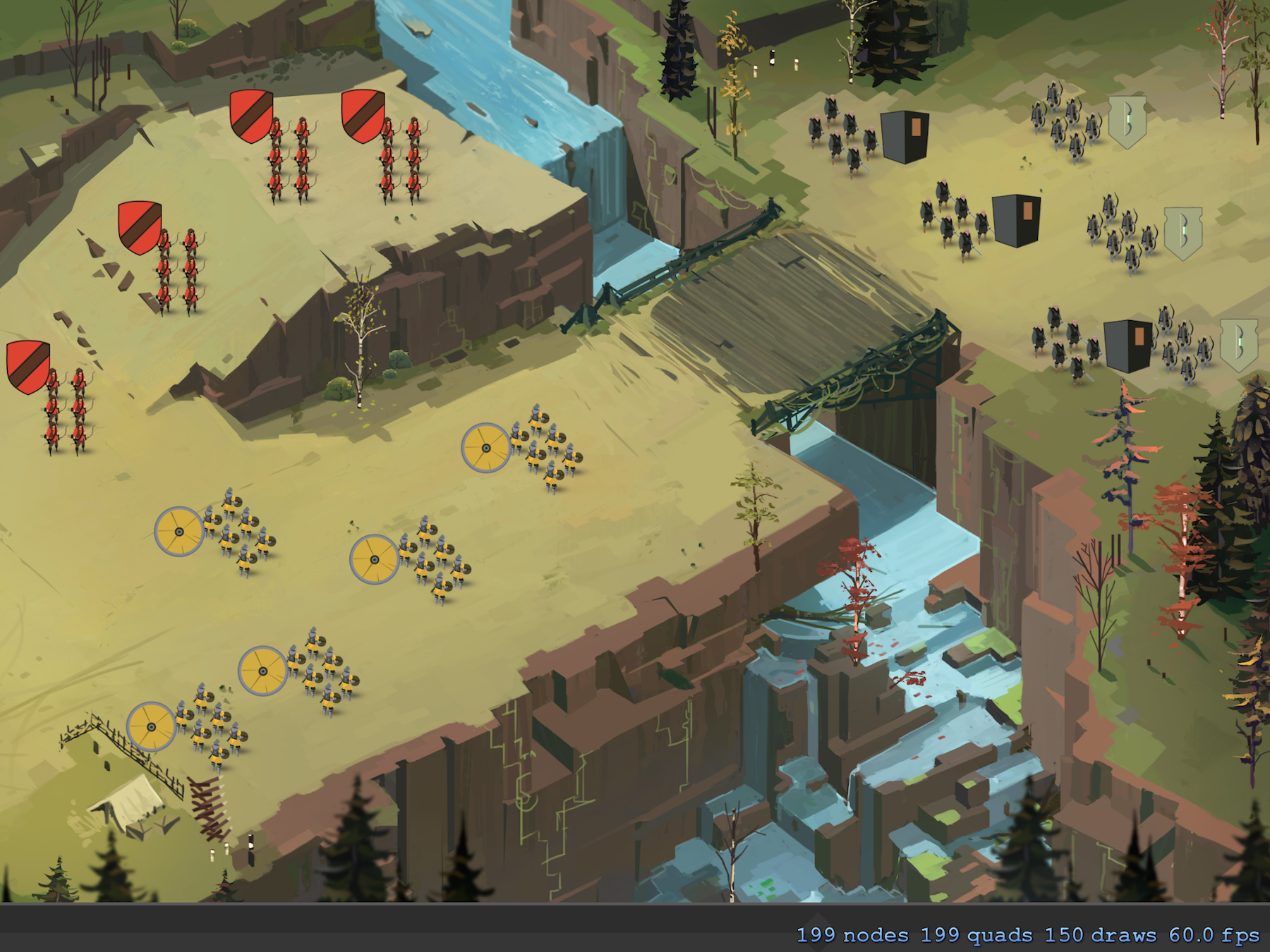
The good news is that I still have plenty of reasonable ideas to increase performance. For the first time, I’m confident I can support 125-150 units at under 50% CPU. That would allow for all of the game design ideas in my head, and plenty of additional CPU for art, sound, effects, etc.
It would be too much to explain everything I’ve tried in this post, but I hope to go over it later in a blog post. It’s just important to note 5-7 full work days were spent just tweaking code.
Icons
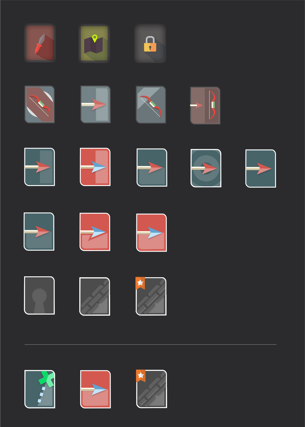
I’m learning that I have to develop some basic art skills in order to get this game to work out with a reasonable budget. First example: Icons. My game may have 50+ icons. I could have Scott think on, design, iterate and finalize all of them. I would love to do that, but it would become to expensive. So, instead, my approach for icons and the HUD in general is to do as much of a first take as I can. If I can think of every icon and give it a starting point, then hopefully Scott can make minor changes / filters to bring them in line with his style.
Anyway, that said, here is my first take on icons. Love the progress I have made, but they aren’t quite there yet. Need them to look more like they belong with the maps / characters.
World Map
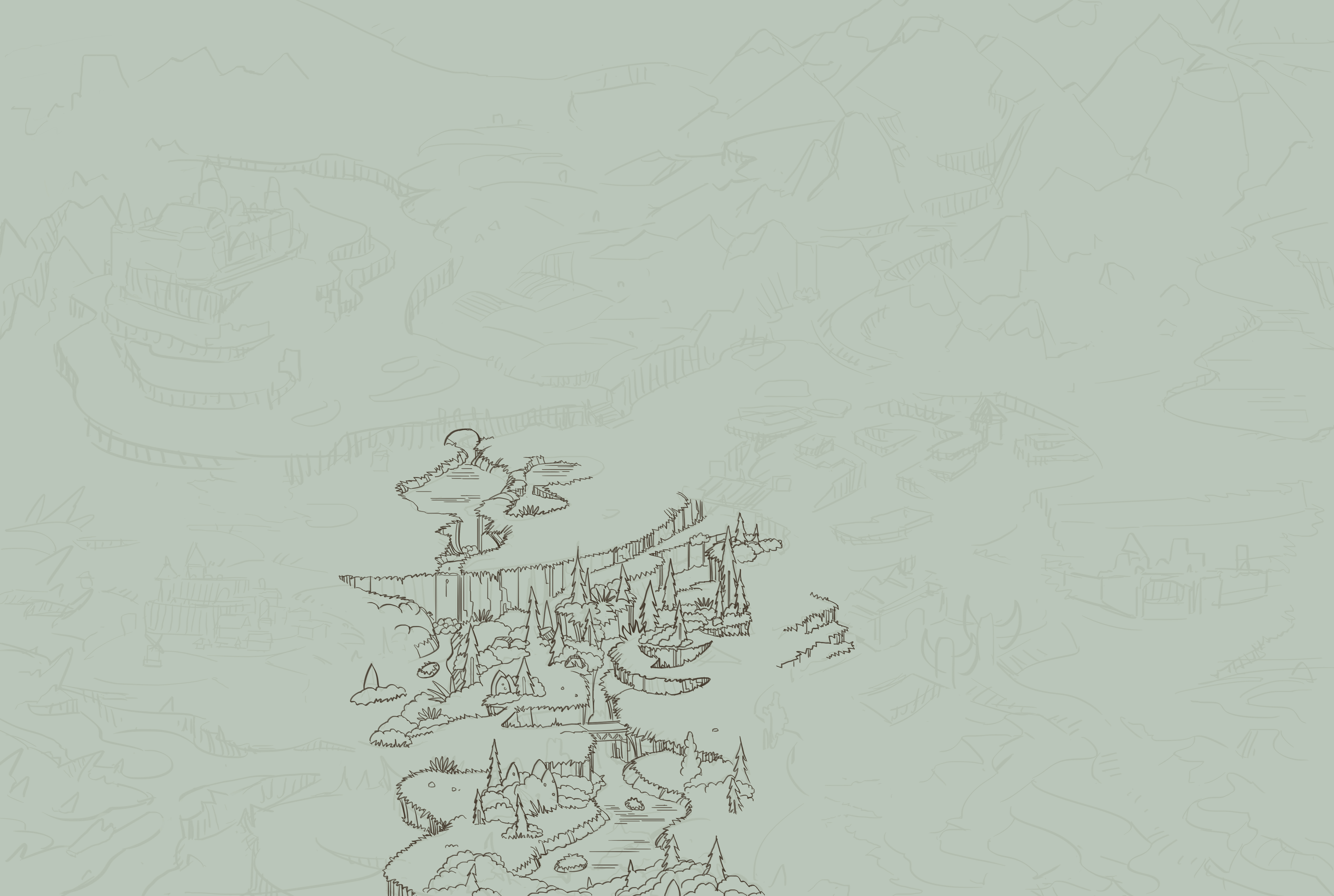
Designing the world map took more time than I thought. The story illustrations and level illustrations have to be considered so that it makes logical sense. If the story has a river in the background, the world map should show that. Obviously, it doesn’t have to be 100% exact, but some consistency is desired. On that same note, the path that the character takes throughout the map should make sense with the story. For example, you would’t cross 75% of the map for resources if that same resource could be found much closer. So, I thought through that, and came up with a rough illustration for Scott. I have a separate blog post in mind for this process, so for now, I’m just going to leave a teaser.
What’s Left and What’s Next
Rough break down:
- 6⁄15 levels
- 21⁄26 characters
- 14⁄15 cutscenes
- 0.7 / 1 world map
- 0 / 1 start screen
- 1 / 1 camp screen
- 0 / 1 interface
- 0 / 1 polish like rivers, birds, flags, etc
- 0 / 1 marketing materials
There will be more screens in the end, but that doesn’t matter for now. The main focus is the levels, characters, cutscenes and world maps. I’m excited that the story mode / cutscenes are nearly complete. The camp screen and credits screen are also finished, but I’ll reveal those later.
Next week, I plan to focus more on getting level 1 in game working. Units should die, and there should be a game over state. After that, enemy AI, followed by enemy waves.




Thank you
Your comment will be published once it has been approved.
to see the pull request you generated.