How Designing This Site Prepares Me For Game Development
Whether it be video games, web development or mobile software, coding is coding. And launching something is hard. Every developer knows that. One of the main difficulties comes from design. Or, more specifically, polish. Anytime I can exercise my design muscles, I’ll be better prepared the next time around.
Just in case there is any doubt on how hard it is to ship, let’s take a quote from Ben Serviss:
Because even if you intellectually know how to do it, actually shipping something is really, really hard to do.
While releasing something is hard for the standard variety of reasons — fear, time constraints, missing features — I believe the number one reason is because it takes tedious, boring and tough effort that not everyone is prepared to do. It becomes easy to cut corners, or to make exceptions. Let’s look at how design is a driving force behind many frustrations.
Iteration
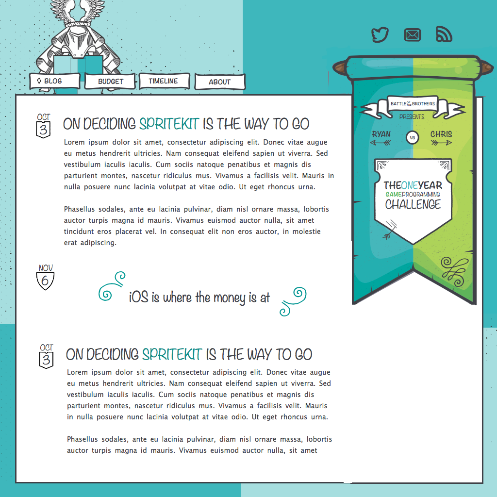
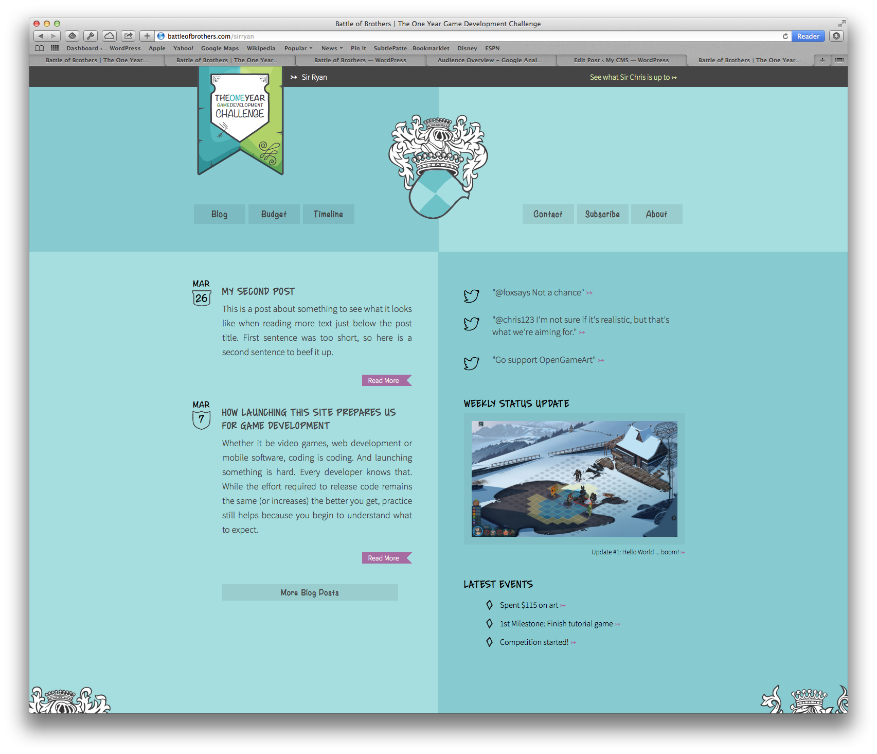
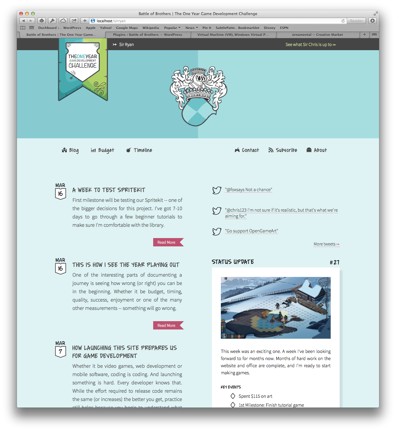
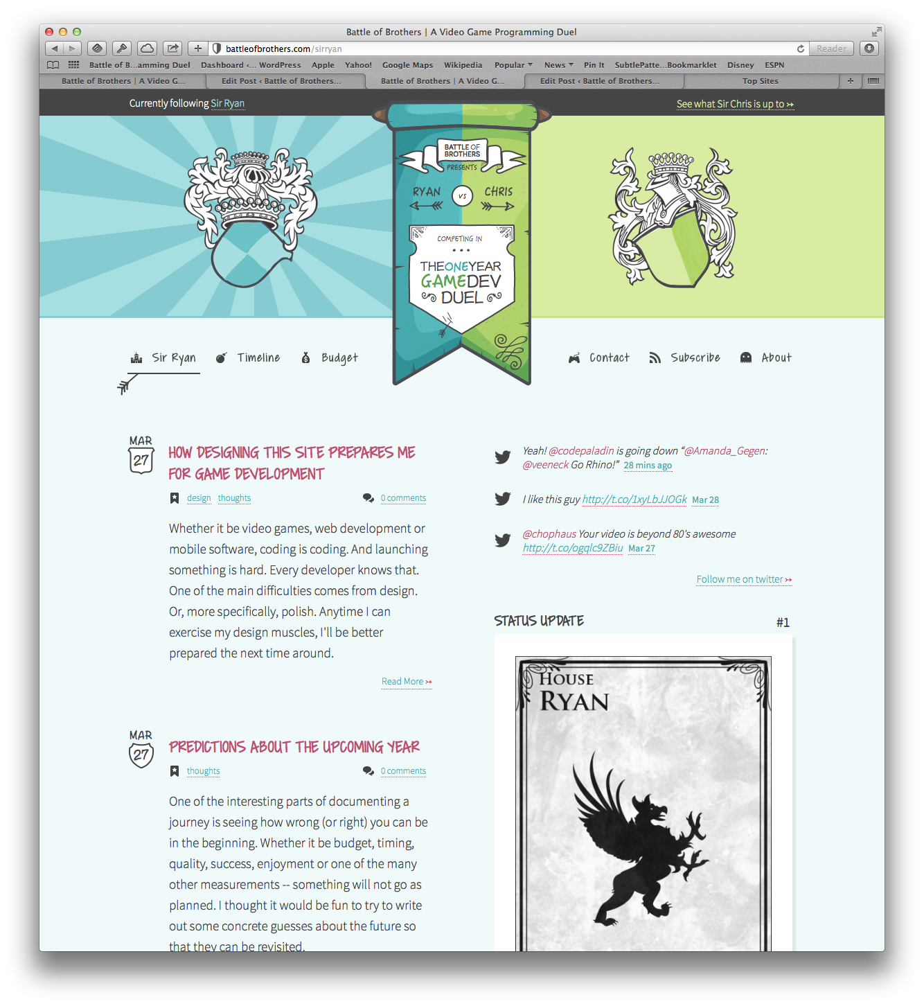
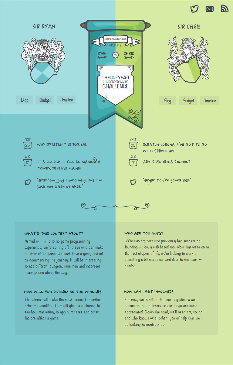
Neither of us here at Battle of Brothers are designers, so any practice is good practice. Right away, it became clear how time consuming design is. Ideally, we could iterate forever, but there was a deadline for this site. With that in mind, let’s see how things have come along.
Notice how the site slowly gains character and becomes more organized. While far from perfect, each iteration adds a bit of detail. This same idea applies directly to game development. Iteration is equally as important with games. I’m under the impression that I’ll spend a few weeks getting a cool character to animate across the screen, and then a few months making that feel right and function intuitively.
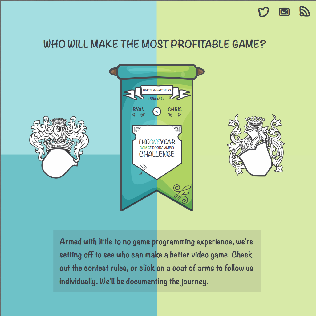
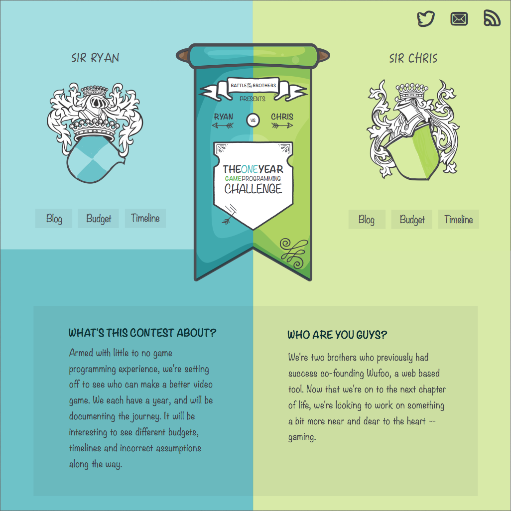
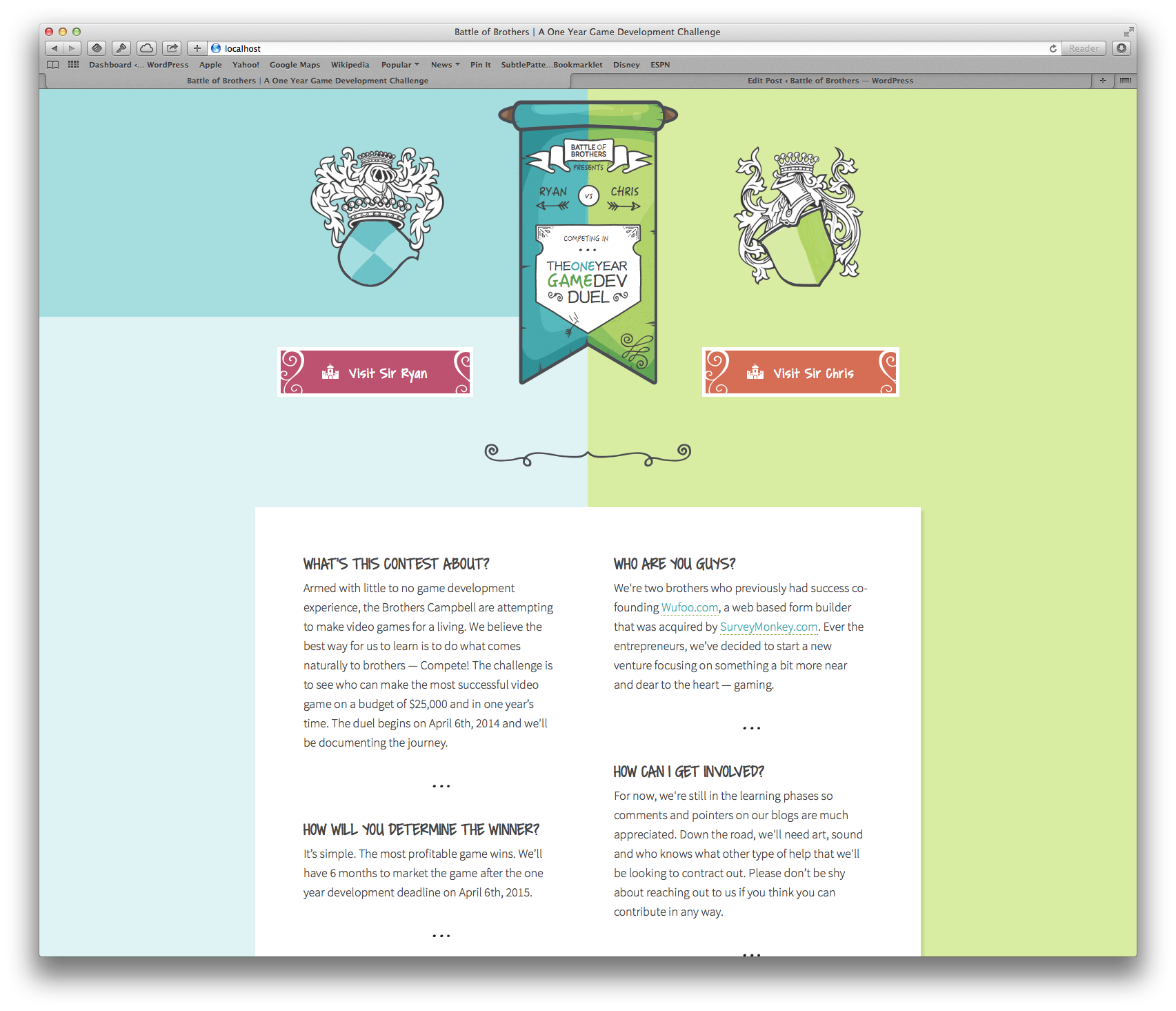
As another example, let’s have a look at the home page:
While a lot of the changes are subtle, they are mostly driven by a problem. Not enough content, not legible enough, no context — the list goes on and these are the types of problems I’ll face as a game developer. Tackling the programming problems should be the easy task, so any experience looking at design problems will go a long way towards improving future products.
Details
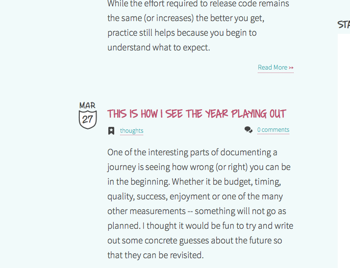
Details, polish, and going the extra mile all take an exceptional amount of care and thought that results in a product with character. I’ve recently heard it described as adding ‘Juice’ to your product and it sums up a sentiment that is hard to convey — if you show you care in your work then other people will connect with it.
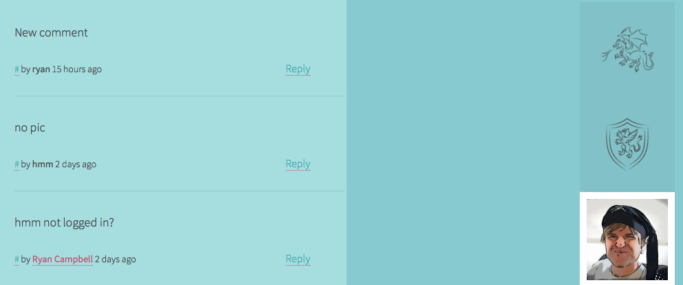
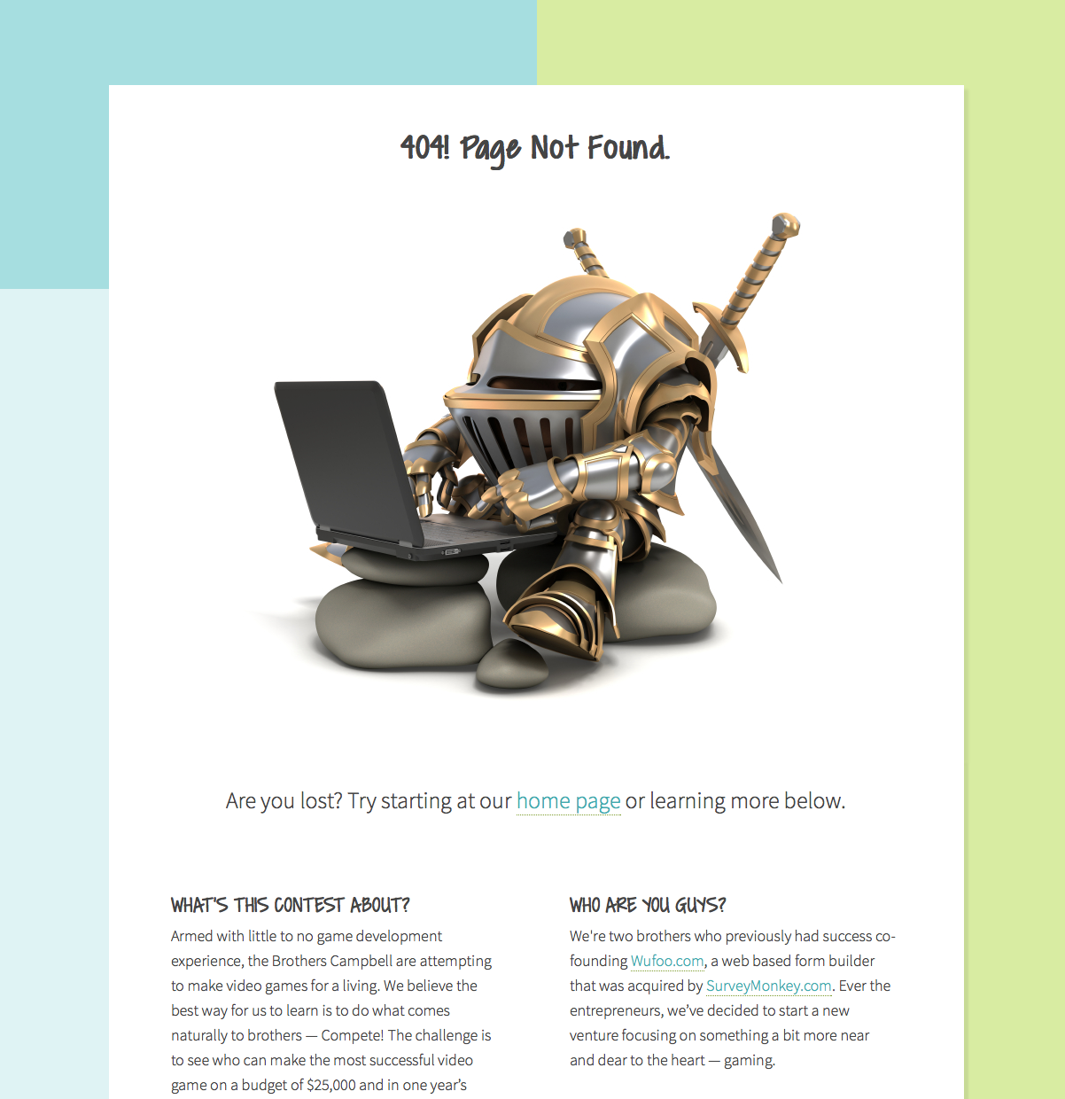
The pictures above show some of the ways I tried to care about this site. The timestamp shields randomly change. The default gravatar in comments rotates between 12 images, which required digging through WordPress code. The about pages have personality and the 404 is fun.
Remember, the point here is not to show how super awesome this site is. Instead, it’s recognizing that details are hard and time consuming. Just by implementing them, I feel better equipped to manage time with my game.
Unknowns
Perhaps the most frustrating thing that can happen with design is to design yourself into a corner. Once a visual design is mostly implemented, or a user flow pattern is decided on, you can be somewhat restricted in implementing a new feature. The two most painful examples with this site are tags and comments.
Tags are a common concept in WordPress, and it is expected that sites will use them. What’s different about this site is that it is basically two blogs under one roof, so a lot of WordPress functions have to be split. So when it became time to implement a wordcloud, everything took longer than expected. And since the site is designed around the use of tags, I had no choice but to figure out a way to implement the feature.
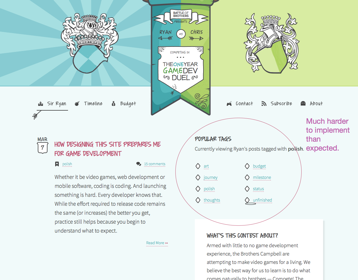
The comment system reached the unfortunate point of having to rewrite the code completely. I pushed the default theme as far as I could until too many hacks were introduced. At that point, the comments were barely usable and the design to the entire site was already in place. So, the only option was writing custom markup in a custom function for WordPress. Doable, but a stressful and unexpected day of work during a time crunch.
While it is impossible to plan for all unknowns, experience does help. I’ll prepare my next WordPress site a bit differently than this one. And with games, I’ll try to revisit code early and often to avoid boxing myself into difficult situations.
FINISHING IS KING
While this post just looks at design, it’s easy to see how it could be three times longer if I addressed all benefits of launching something. This site helps with getting feedback, organizing code, learning new things, making a commitment, working as a team, and the list goes on. Every benefit is a direct result of one concept: finishing.
Finishing something isn’t about perfection.
One of the strongest skills I learned from working on Wufoo is understanding what it means to finish something. It sucks. What starts out fun slowly becomes a sea of error handling and validation that feels like homework. I know this concept will be exactly the same with game development, and I’m prepared to do the work.




"Neither of us here at Battle of Brothers are designers," and yet this site looks so nice! you guyz are awesome!
Appreciate it. Problem is that it took forever (~2 months) to get it looking this way. Hopefully I can speed up the output as I get into game design.
go team ryan!
I think Wordpress multisite feature could have been great for this. You could create 2 different sites under same installation of wordpress (with same or different theme) and easily link them together. Both use own widgets/plugins etc.
Ah, good to know. Will check it out, thanks.