Level Design – Concept to Creation
I’ve been working on level design with an illustrator for the last couple weeks and things are really moving along nicely. What once took about 3 days of work is now condensed down into almost a day. We have 5 or so levels knocked out at this stage and I thought I’d share the process on how they come to life.
World Location
The levels in my game serve two purposes. The obvious purpose is to host fights where the forces of good battle the evil minions. The second and equally important purpose is to help bring the world to life. My budget is limited and I’m not sure how much, if any cut scenes will make it into the game, so by giving the battle scenes unique architectures and landscapes, the player is immersed into the world.
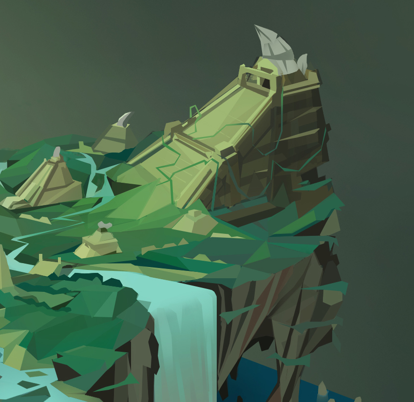
The level that I’m highlighting in this blog post takes place at the top of an Aztec-Like pyramid, so the goal is to highlight what the pyramid and it’s surrounding area look like.
Inspiration
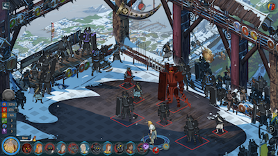
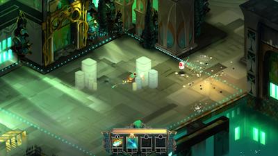
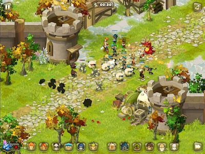
I have a folder with screenshots of other isometric games including, The Banner Saga, Transistor, Dofus, Diablo 3, and many more. I don’t want to copy anybody else’s style or battlefields, but I do get ideas on what types of artwork can be made from an isometric perspective. For example, these screenshots show you what can be illustrated on a cliff, in a castle, or on an open battlefield.
I love the cliff battles because they allow for a lot of background imagery, so that’s what is being used in this example.
Grid Mockup
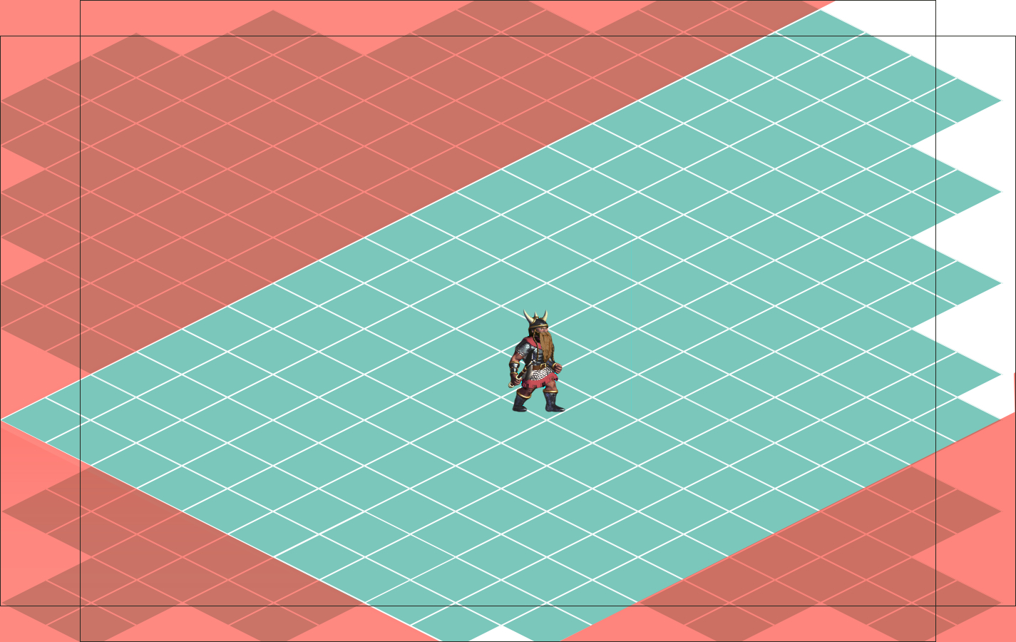
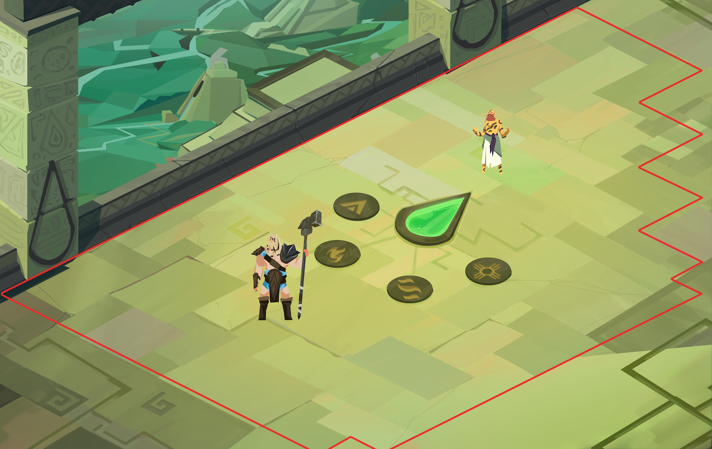
It’s kind of important that the battlefield is close to pixel perfect because the characters walk on a grid of 128×64 rhombuses. So what I did was is create a base image that’s 1425 x 900 pixels and overlaid with rhombuses. I then make the playable area a turquoise green and the non-playable area red. I send that over to the illustrator to bring to life.
First Take
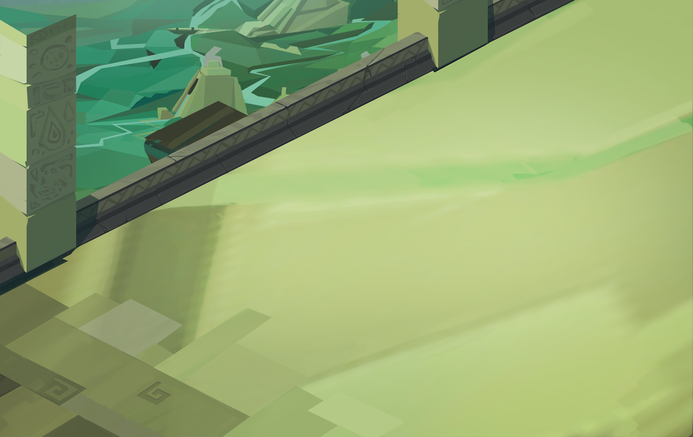
The illustrator will then take a couple hours to create a basic mockup just to make sure the dimensions, colors, and overall feel are correct. I’ll take the mockup and test it on an iPad just to make sure things look right and the grid works correctly.
Iterations and Detail
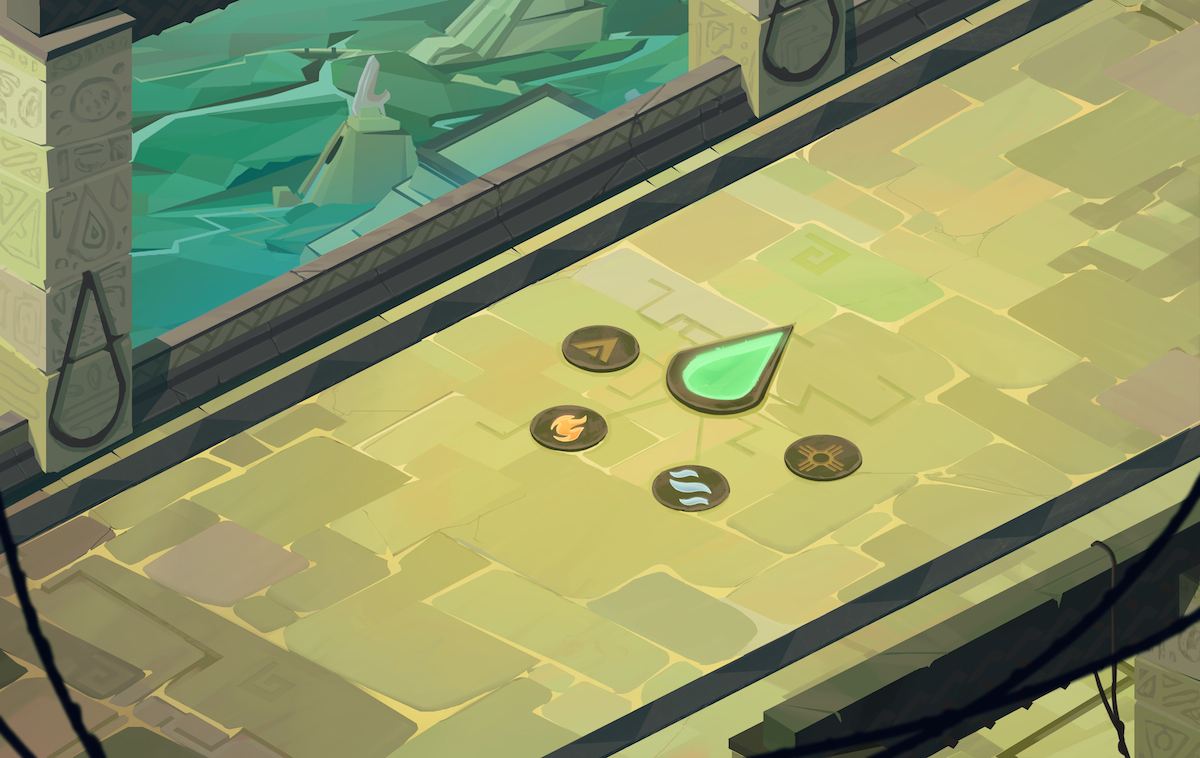
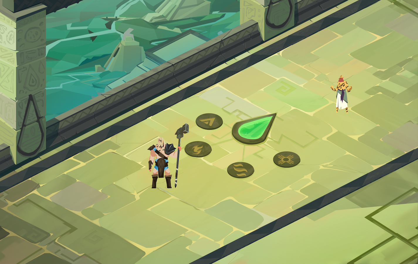
After he gets the OK on the basic mockup, each subsequent illustration comes back with more and more detail. We go over each iteration to see if anything needs to change.
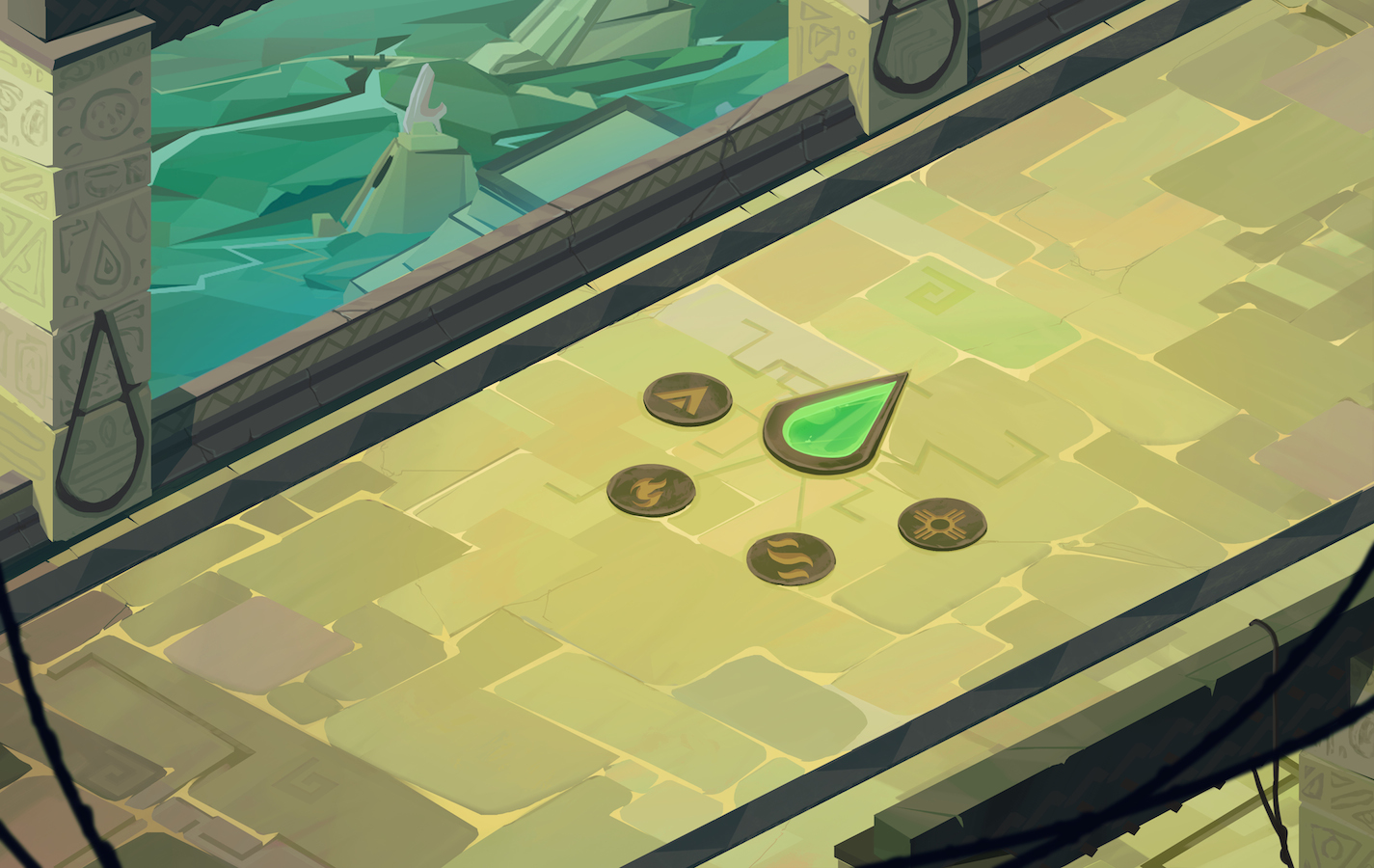
After 4 or 5 iterations, here is what the level looks like all said and done.





Thank you
Your comment will be published once it has been approved.
to see the pull request you generated.