Intro Video, Artwork, and Audio
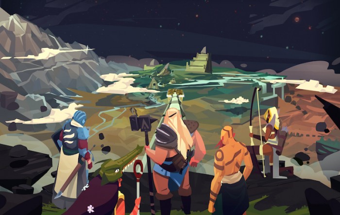
 This post is a status update, which is how I track progress specific to my game.
Check out my timeline to see what I've recently accomplished.
I have a lot to share this time around, including icons, character animations, splash screens, world map animations, music and sound, and cut scenes. But the biggest achievement over the last two weeks was completing the first take of the game’s intro video, which you can see below.
There isn’t any sound added to the video yet, and there are parts that I just don’t like, but it’s always good to get something relatively finished. I’m going to hold off on tweaking or even looking at this video for a solid month so my brain can decompress. I have a tendency to dislike anything I’ve 10,000 times over the course of a month, so I’ll have to come back with a fresh set of eyes. Any feedback is always appreciated.
Animations
I have about 11 of 18 full character animations completed now, and the latest addition is the spearman character.
He’s from the desert area in the map and the inspiration for his design was the Aiel race, from the Wheel of Time. I’ve always liked the idea of this character and Dustin Bolton did a fantastic job bringing him to life.
Artwork
I received the last large illustration that I’ll need, which I’ll be using on the marketing website and for a cut scene in-game. Since you’ll be eventually seeing it on the website, nothing will be spoiled by sharing that with you now.

Now that the large illustrations are complete, it’s time to move onto some of the finer details. The world map needed some love in a few areas:
The Waterfalls
I wasn’t completely happy with how the waterfall looked during the first pass because it looked a little too chunky, for lack of a better word. Scott took another shot at it and I’m happy with the second take.
Similar animations were created for the other waterfalls on the world map, so I think we can scratch world map animations off of the to-do list.
Battle Markers
Like many mobile games, my game will follow a fairly linear path and have markers to display where battles happen. I had Scott draw up some ideas on how we could mark those battles and here was his first attempt.
I liked parts of 5, 3, and 9, and we tried out 9 to see what it looked like in-game. I think the icon looks kinda cool, but it just didn’t seem to look right on the world map.
I also didn’t have a good idea of how to show when a battle is won or lost. We went back to the drawing board and I asked Scott to make markers that looked more like flags. The flags could change colors when the good guys won, Scott suggested making more elaborate flags for the boss fights. Here’s what we came up with:
I’m happy with how these are looking and they offer all of the flexibility I need for the different game states. There will be some additional visual queues as to where the current battle is located, and I think these will be pretty close to the final design.
Hero’s Path
It’s not a huge deal in the game, but it’s worth pointing out just to illustrate how many choices and changes there are in game design. The original hero’s path looked like:
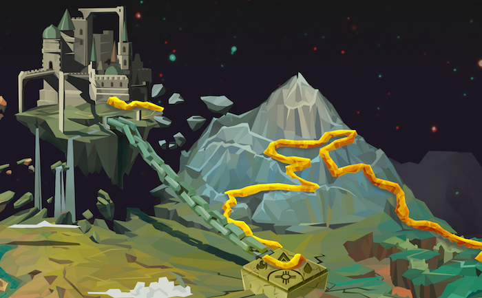
The problem with that path was that it doesn’t look bad in isolation, but the world map looked crowded and messy when it was completely covered by that path. That path was also awkward to add the battle markers to. So Scott re-did the path to look flatter, which you can see in the previous images. Re-doing the path masking and the design of the new path will take a couple of days, and it’s those type of little decisions that make a game late and over budget.
Icons
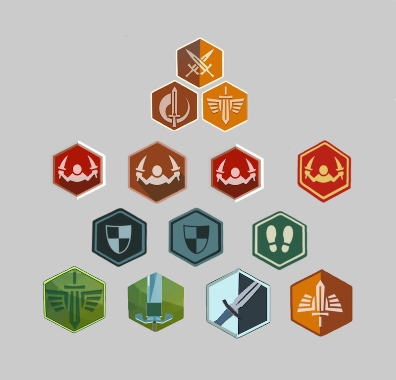
I spent a few days playing around with icon design just to get a general feel of what will look decent in-game. I’ll have Scott put work some of his illustrator magic on the final designs, but here’s a bit of what I’m testing out.
Sound and Music
The last, but definitely not least, important news to share is that I’ve found people to handle the game’s sound and music. The sound will be handled by Wes Slover and the music by Brendon Williams. We haven’t really gotten started just yet, but both of these guys are extremely talented and I can’t wait to work with them.
As a side note, a lot of audio people have reached out to me in recent weeks, and they have got to be some of the most helpful and nicest people I’ve come across. It’s generally not good to stereotype an entire profession, but now when somebody tells me that they’re a sound or music designer, I instantly think they’re a good and fun person. Kind of like a dolphin trainer. Have you ever met an evil boring dolphin trainer? Exactly.
Next Time
It’s time to start bringing this thing together, so I want to add a start button to the end of the intro movie that actually brings you to a new game that has a working world map and first level. I’m not sure if I can finish that in the next week or two, but that’s my major goal in the near future.



Hello! This competition between you and your brother grabbed my interest from the start, so great job to both of you on the progress you've made. It has been fun to trace your concepts from inception to where they are now. I'm not sure if this is a preferable place to provide feedback on your intro video, but I will anyways. If the text in the video will be voiced, and therefore not displayed, it would affect what follows. Hopefully you find it helpful regardless. One of the things that struck me right away was that the storyteller stayed on screen for nearly the entire video. It became difficult to follow the monologue from the speaker and keep on eye on the new images that were coming into frame (and their animations). Overall, I missed pieces from the text while I was looking at the changing imagery, or I missed animations in the images while I was reading the monologue. It would be helpful to focus on one image at a time, full screen, with the text laying over it. Example progression: [Storyteller scene] with lead-in text switch to [Castle scene] with "A tale of castles" switch to [Hero scene] with "and heroes" switch to [Evil Silhouette] with "and evil." Opening the video with the storyteller scene is sufficient to communicate the fact that the rest of the intro is being narrated by him. The user can then take the posture of one of the listeners, and the art (which is stunning) can be appreciated much more fully. The viewer will be free to consume the story, without distractions. If the text will not be shown, and the story told with audio, I feel that a similar mentality still applies. The orator need not be displayed past the beginning of the video (but again at the end). I really loved the final scene, in which the sky castle panned into view when it was being referenced. It seems like it will lead into the gameplay well, and sets up things nicely. If you do end up seeing the storyteller multiple times throughout the video, it would be helpful to adjust the characters slightly. A different gesticulation for the speaker or some other change would help indicate time had passed during the monologue, and it would loosen the feel of the entire video. I am sure you will continue to tweak it, but there were some cadence issues I noticed with the video as a whole. Sometimes text left very quickly, and sometimes pauses between scenes were too long. You may be familiar with the story, the art, and the direction of the game, but the user will not be. Great work thus far, to both you and your brother, Rand
I'm curious, what format are you exporting your video so that it fits inside the game and looks good on various devices? I am working on an indie game for the iPhone and iPad, and I just exported the video so it was 1920x1080 Apple ProRez 422 - The 43 second opening video is now 930 MB.
Right now the video is at the same resolution as yours, 80 seconds, and 100MB. I'll play around with shrinking things as much as possible, but I don't know any way of getting around a large file. My game has a lot of assets and I won't be able to get the game under the WiFi cap limit even without the video, so I'm not too concerned with the large file size.