Animating a Path Using Image Masking
I recently found myself wanting to animate a character’s progress path and initially I thought I would do this by creating multiple animation frames, much like a sprite. After a bit of frustration, trial and error, I realized that creating an image mask was a more efficient and effective method.
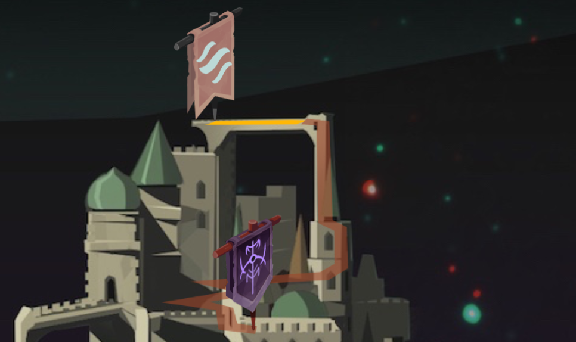
To give you an example of what I was trying to accomplish, here is a picture of a portion of my game’s world map. The yellow and line is the path that my character takes.

I wanted to animate the yellow path that shows the character progressing from point A to point B, kind of like this:
At first, I thought I could accomplish my goal by cutting the path up into 50 or so tiny .png files and then placing them onto the screen. While this is technically possible, it became extremely time-consuming. Because each individual .png file was a different size and had to be placed on a pixel perfect location, animating it became an extremely tedious process. Changing the world map or the path itself would have been an excruciating process.
Next, I thought I would make something like an animation sequence, where the 50.png files were exactly the same size. This would remove the problem with pixel perfect location for each individual image, and I started to go in this direction. The problem with this technique is that the game’s artwork tends to evolve and if I were to change the color or texture of the path, I would have to re-cut everything from scratch.
Lucky for me, Ryan told me to take a look at masking, which proved to be much easier. If you’re not familiar with how masking works in Corona, check out their basic tutorial. What I did is instead of cutting up the path .png image into a bunch of files, I made a bunch of mask images that could be overlaid on top of the path.
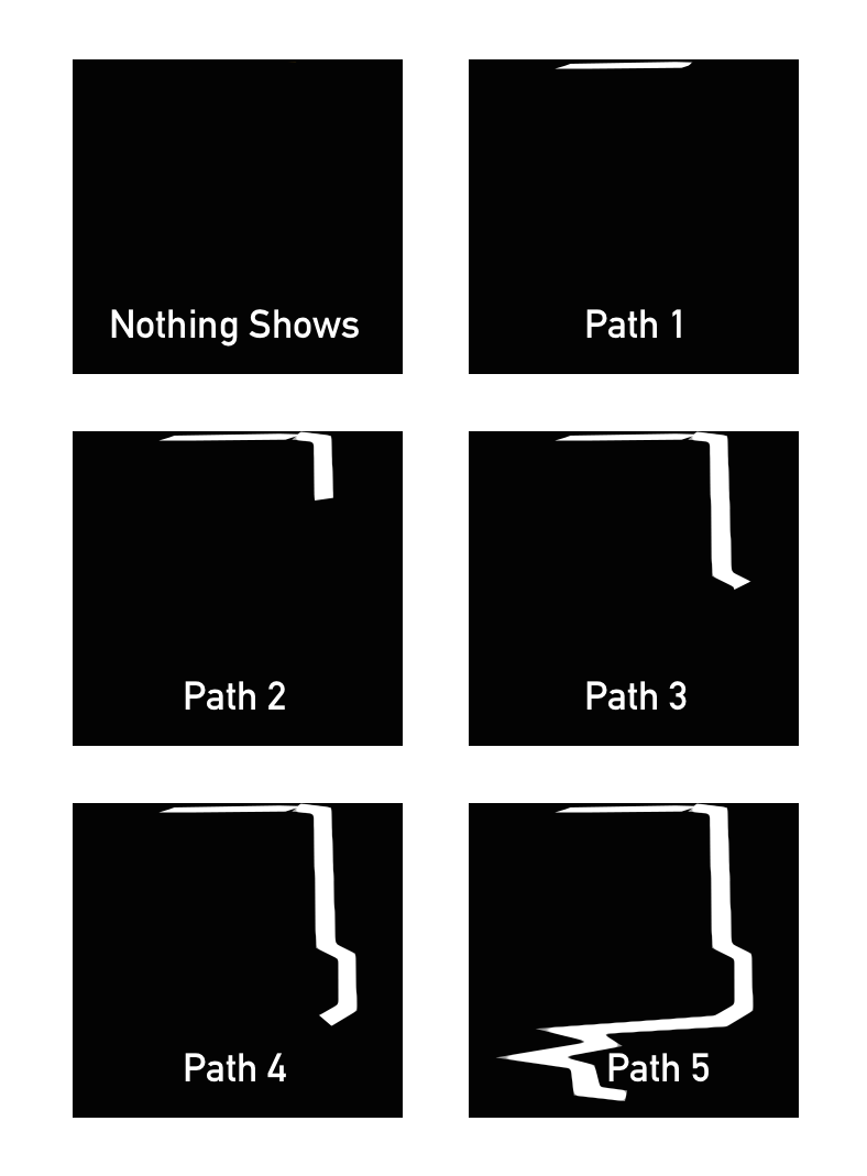
To illustrate this, take a look at the image below:

The base image is what the path looks like when it’s fully drawn. If you use the first mask image, labeled “Nothing Shows”, as a mask over the base image, then none of the base image shows. If you lay the second image, labeled “Path 1”, as a mask image, then a tiny part of the base image shows. What is in white on the mask images is what will show when laid on top of the base image.
I created about 40 of the mask images, each with a little more of the path shown in white, and labeled the files mask1, mask2, mask3, etc. Then I was able write a loop that sequentially applies each mask image over the base image.
https://gist.github.com/codepaladin/c2d7921dd50d23898683
What’s great about masking is that the mask image is always drawn exactly over the base image. I only need to worry about pixel precision when placing the base image and the mask images will automatically be displayed in the right location. And it’s no problem if I change or alter of the yellow path, because the mask stays exactly the same. As a bonus, I can do other cool things with masking like add gradients, brush strokes and other effects by simply changing the shades of grey in the mask. Here’s an example of what I’m talking about.


[…] I went over in the last section, masking images is a widely used gaming technique in which I had no experience. Like I did with so many techniques, […]
Hi there, depending on your needs I believe there is a better way. Instead of using and creating multiple images for the mask, you could use a single image with a gradient and then use a shader to animate it smoothly, with a single uniform. Furthermore you could also add a noise texture to make it visually more interesting. I also did a quick and dirty test in Unity3d (https://dl.dropboxusercontent.com/u/768434/pathAnimation.zip), so you can check it out yourself The textures I used http://imgur.com/1Hjht5A What the end result looks like http://imgur.com/2HE3Ilt (please note that the gradient isn't perfectly smooth, because the steps aren't spaced evenly, since I created the texture rather quickly. With a smooth, evenly spaced gradient the result would be much nicer) The fragment shader: float4 frag (v2f i) : COLOR { // set color float4 col = _Color; // apply mask col.a = tex2D( _MaskTex, i.uv ).r * 1.2; // mutliply by 1.2 so _NoiseTex can't hide passed positions // if gradient is smaller than _Position + _FadeAmount col.a is zero // if gradient is bigger than _Position col.a is one // values in between get smoothly interpolated col.a *= smoothstep(_Position + _FadeAmount, _Position, tex2D( _GradientTex, i.uv ).r); col.a -= tex2D( _NoiseTex, i.uv ).r * 0.4; // mutliply by 1.4 to reduce _NoiseTex's effect return col; } with _FadeAmount you can set how large the transition should be and with _Position you can set how far the line should be drawn (please note, _Position doesn't perfectly go from 0 to 1 here, since _FadeAmount adds a small offset and the lowest and highest values in the gradient aren't either)
Once the paths are less likely to change, a good way to improve performance would then be to put thetextures in the r,g,b,a channels of a single texture, thereby also reducing memory footprint and tex2D calls
Thanks for the detailed reply, Stefan. When I wrote this post Corona didn't support custom shaders, but they actually just launched that feature last week - https://coronalabs.com/blog/2015/04/15/custom-shader-effects/. I should be able to now use your example to make my path animation a bit easier.